Cognitive Overload at Equifax
Product Background
- Equifax is one of the big 3 credit reporting bureaus in the United States and is infamous for its 2017 data breach which exposed the personal information of ~143 million Americans. (Link)
- Their handling of the crisis was even worse and the ultimate security solution for most users (credit freezes) was further undermined by Equifax’s inability to generate random pin numbers that are used to unfreeze a user’s credit file. (Link)
- More recently, Krebs On Security discovered that Equifax had opened yet another security hole in their new MyEquifax portal allowing a malicious attacker to bypass credit freeze pins previously set by users if they can get past the initial challenge questions. (Link)
- To remedy this as a user, one needs to register on the site to ensure a malicious actor can’t act and unfreeze your credit without your knowledge, resetting your pin in the process.
- As an aside, if you haven’t yet frozen your credit at all major reporting bureaus, you should spend the next 20 minutes accomplishing that task.
UX Issue
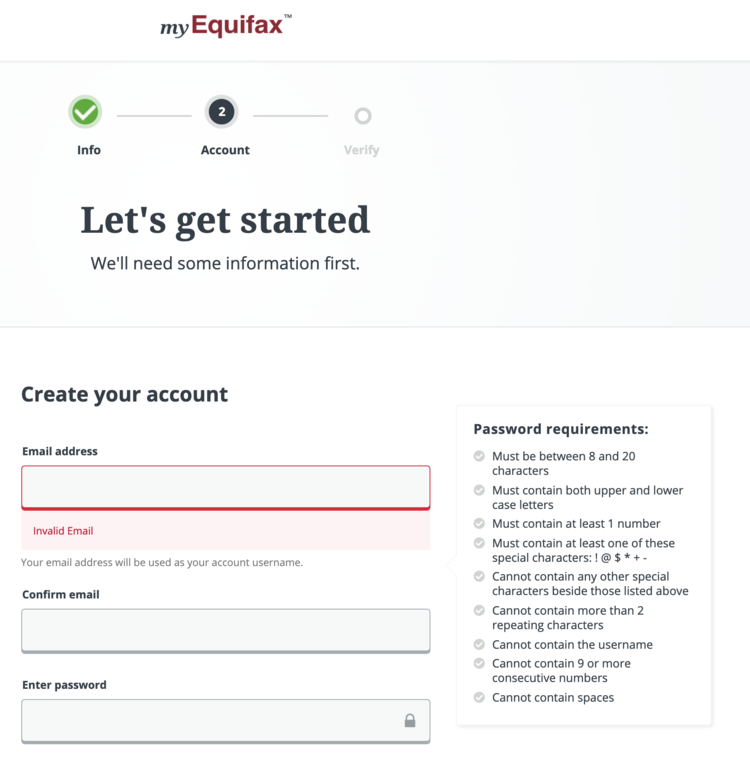
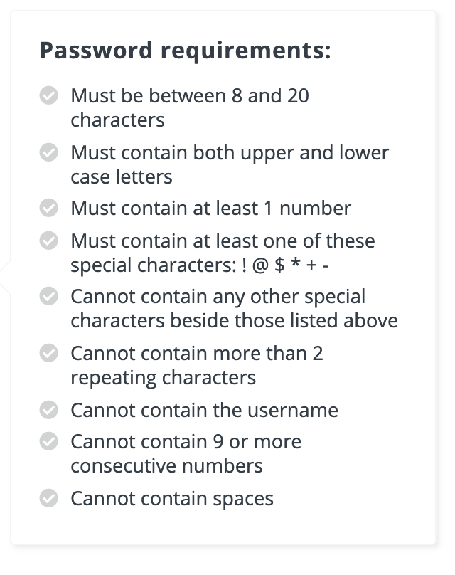
The challenge is that you will need an engineering degree in order to formulate a proper password! There are no less than 9 different password requirements that the user must pass in order to input an acceptable password.


It is challenging enough for most users to have unique passwords for every site, it is another level of cognitive overload to force the user to take out a piece of paper to write out a password that they think matches Equifax’s validation rules.
It is also interesting to note that many of the rules are likely not commonly occurring patterns, such as containing 9 consecutive numbers or spaces, and are therefore adding additional cognitive burden to users that wouldn’t have made those choices anyway.
Additionally, having more rules counterintuitively makes the passwords easier to crack, because now there are fewer possible password combinations that need to be tried!
Potential Remedy
The potential remedy in this case is to have a competent IT team across the board, but that is unlikely to occur at Equifax.
More seriously, the key takeaway from this post is that if this sign up flow were on a consumer app or any application where the company wasn’t a monopoly that forced users to register, most customers would balk at the sign up process and fail to progress further. There is a significant cognitive load placed on the user with each additional requirement added and if those requirements aren’t adding significant value to the user or their experience, they shouldn’t be there in the first place.
While this is a potential UX issue in and of itself, if that many rules are required by your backend password registration system, you may be better off hiding some of the requirements that are infrequently violated and showing those requirements only when violated by the user, reducing the cognitive load for most of the users on the platform.