Details Matter, Even the Subtle Ones
Product Background
While Apple has had their fair share of design missteps, Apple has remarkable product design consistency not only across products, but across platforms as well.
User Experience
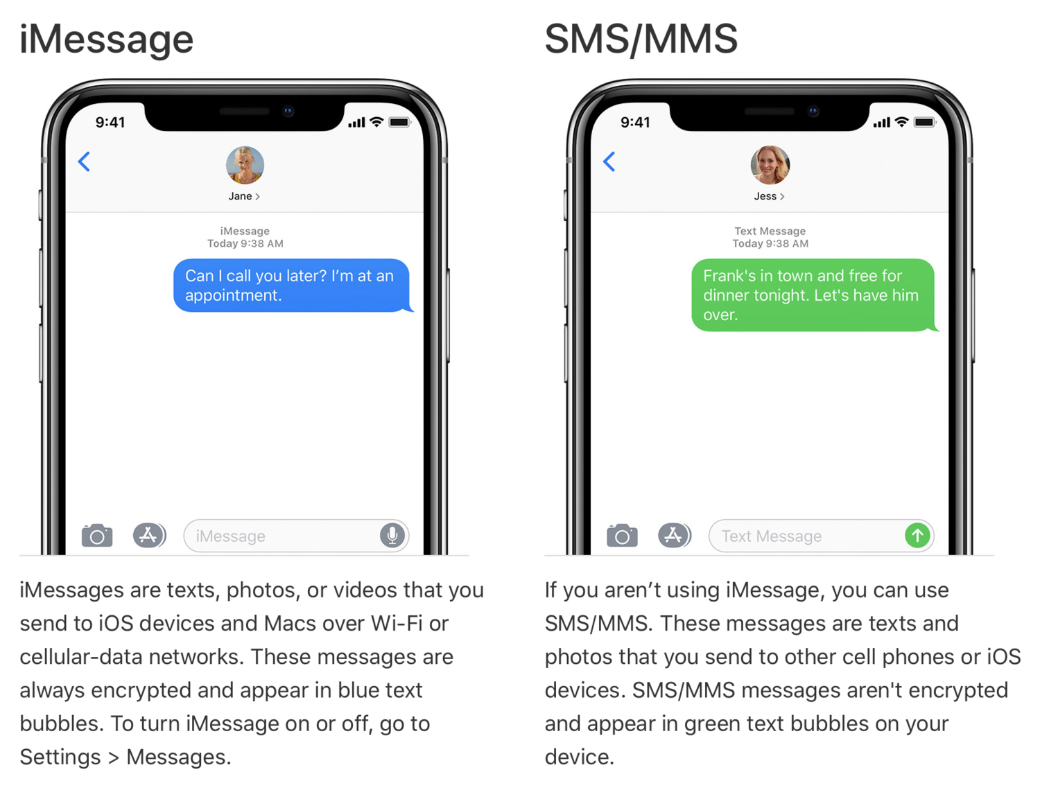
Most smartphone users are familiar with the “blue bubbles” that indicate whether a given message is an iMessage versus a light green which indicates a normal text message. This style is consistent across all iDevices (iPhone, Mac, iPad, etc.). More info at Apple, but image below.
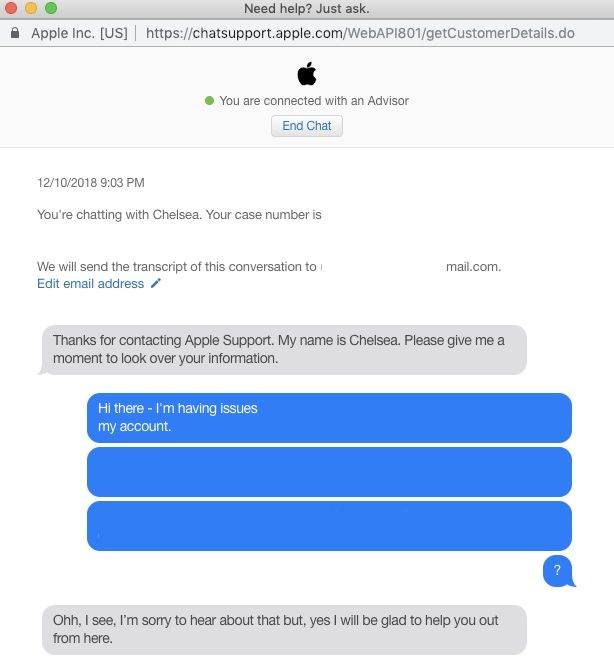
This color scheme is also on display in Apple’s support conducted via web chat as seen in the image below, even down to my response “messages” being the exact same color grey as those in an actual iMessage conversation.
This is a remarkable detail to get right, even at a company like Apple that prides itself on a consistent user experience. This design choice likely creates a higher degree of trust as well as the opportunity for the user to stay within Apple’s carefully curated user experience garden.
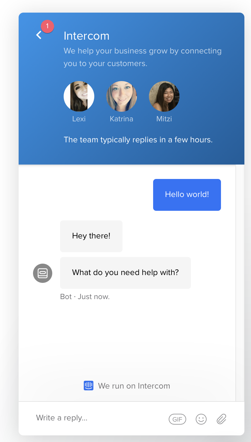
Compare this to Intercom’s chat (which now looks eerily similar to iMessage) or to Zendesk’s chat platform, and imagine if Apple used Zendesk’s messaging platform for support. It would take the user out of the Apple “experience”, which even for just a moment, hurts the world Apple has created and attempts to maintain.