Empire Building in Product Management
Summary
- Empire building is an issue that arises when product managers and product teams are incentivized and rewarded for releasing new features instead of improving the product.
- Even though new features can improve the product, too often product teams conflate “new toys” with improvement, instead of realizing that refining the product by winding down specific features or simply improving the product’s performance would provide more value to the product’s users.
- While typically occurring in later stage, more mature software companies, empire building can be an issue at early stage startups as well, just on a smaller scale.
- The rate of empire building is approximately proportional to two things: the maturity of the product and the rate of overstaffing for a given team beyond what maintenance would require.
Detailed Discussion
- Empire building occurs in nearly every organization at some point and is the result of individuals or groups attempting to obtain or retain power within their organization by pursuing activities that may or may not actually provide value to the organization. Empire building can manifest itself in a number of ways, but typically appears when teams are overstaffed relative to their objective need or when budget is allocated out of fear of a potential failure rather than based on a concrete organizational demand.
- This tends not to occur in early stage product teams because product market fit hasn’t been found yet, and product managers/team leads aren’t sure which areas of the organization are steady enough to build a beached of resources and power around. For example, if the company may pivot its core product and customer target 3 times in the next year, there is very little incentive to build any organizational moat around a certain kingdom when it may no longer be relevant to the organization in a quarter.
- Product empire building tends to afflict more mature software companies, particularly those with products that are consistent cash cows due to a semi-monopoly/monopoly like position in their respective marketplaces. Empire building occurs in this scenario because individuals employed on these products need to justify the existence of their roles, which upon closer inspection are more difficult to justify due to the potential monopoly power the product holds.
- Empire building is a problem for two reasons:
- It produces Winchester Mystery House-like products that are more confusing and more costly to maintain than their predecessors.
- It creates product teams that are more focused on optically important projects that justify their existence than behind the scenes tweaks / quality of life updates that subtly refine and improve the product.
- Empire building is preventable, but it requires technical leadership that consistently questions where resources should be allocated in an intellectually honest way.
- It will likely require product teams to be reassigned to younger and less mature products, which can be a challenge if an individual or team feels emotionally connected to a given product.
- It may also require a reduction in staffing for the product organization in order to maximize the profitability of the organization as a whole. Laying off individuals who have done great work historically, but are no longer truly needed due to the product’s maturity may be the most difficult aspect of preventing empire building.
- Reducing headcount can also be a challenge if the company’s political environment will not reward the headcount deduction with “good decision making points”, but instead will punish that division by assuming its relevance is in decline due to a smaller org size. Perception matters in this case and avoiding this trap is difficult and will require buy in across the management team.
Examples
Examples of empire building abound across the mature software company landscape.
- Twitter
- At its core, the product allows individuals to post short messages and broadcast them to a community. That is it!!!!
- The product is successful because it has achieve a critical mass of users that derive significant value from the network effects of Twitter.
- While there have been some small tweaks to the user experience over the years, the management team should have simply realized the core value prop and shifted to a leaner team earlier in the company’s history. This likely would have allowed Twitter to focus on its advertising business and make a profit sooner than last year.
- In Twitter’s 10k, they were quoted as having roughly 3,300 employees, with a quick search on LinkedIn approximating around a couple hundred in Product Management and UI/UX. This is a significant staffing commitment for a product that has largely stayed the same since its release in 2006.
- eBay
- At its core, eBay allows buyers and sellers to interact on a platform with a feedback mechanism to handle bad actors. That is it!!!
- Again, the product is successful because it has achieve a critical mass of users that find value in the vastness of eBay seller’s product catalogue.
- Again, while there have been some minor tweaks to the listing page, addition of Buy It Now, free photos for listings - the experience has largely stayed the same since eBay was launched in 1995.
- As of December 2017, they had approximately 14,000 employees. Assuming 5% are in R&D, that is 700 employees working on refining that experience that truly doesn’t need refining.
- Google
- Google is a slightly more interesting case because their product portfolio is incredibly vast and provides many services to a diverse set of customers.
- However, empire building is still present and is perhaps most obvious visually in Gmail’s recent redesign which is a consequence of the grand effort to unify the design language across all of Google’s products.
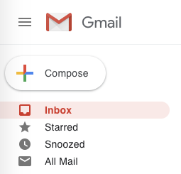
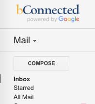
- Below on the left is the new design on my personal Gmail account while on the right is the old design that I am trying to hold on to in my Berkeley Gmail account. Keep in mind that both examples below are on the densest information setting for Gmail. If you the user thought that “dense” old gmail and “dense” new gmail would be similar, they aren’t even close.
- Comparing New vs Old Gmail
- New Gmail has a compose button that the user should be able to see from outerspace. New Gmail Dimensions (166px by 48px) vs Old Gmail Dimensions (113px by 27px), or an area of 7,968px sq vs 3,051px sq, nearly 2.5x the size to compose a message. I would argue there are significantly better ways to utilize that screen real estate than a larger compose button.
- New Gmail has label rows that are significantly larger while also adding an icon to each row, which creates a much higher level of information overhead that provides no additional value to users.
- Each label row is now (240px by 24px) vs Old Gmail’s (172px by 18px). On an area basis, that is 5,760px vs 3,096px, or nearly 2x the size.
- Another addition that has added visual clutter is the addition of an icon to each label. This is less of an issue if you just have a couple of labels, but is incredibly distracting if you have a number of labels exposed. This can be seen in the secondary set of screenshots below. What value does this add to the user?
- New vs Old Gmail is a good example of empire building because it likely kept a significant number of product and engineering individuals occupied when it added almost no value to the user’s experience.


