Free Rides? Not So Fast Lyft!
Product Background
Lyft is the primary competitor to Uber in the ride sharing marketplace and provides rides on demand via a contractor workforce.
UX Issue
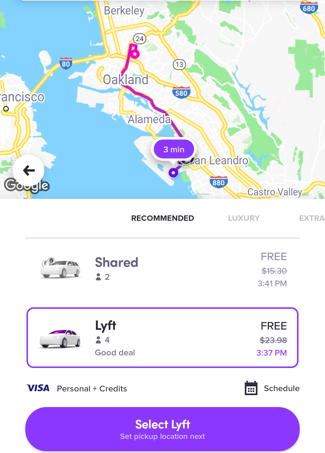
After a recent redesign presumably focused on simplifying the overall user experience, Lyft has inadvertently created a payment frame that is dishonest in how it presents the amount a ride will cost.
- As can be seen in the screenshot, taken on 9/23/2018, Lyft crosses the price of the ride out and says in all caps that the ride is “FREE”.
- A typical user will associate the word FREE as in having no cost to them, but that is not actually the case in this instance.
- The ride is only “FREE” because I have a substantial value of Lyft credit already. The ride will still cost me real money, in the form of Lyft credits that I posses in the app.
- This is confusing because Lyft and Uber frequently offer credits and promo codes to users to incentivize them to take additional rides or to make up for poor prior rides.
Potential Remedy
- What should ideally occur is the user is shown the price of the ride, minus any credits and promos that they have, illustrated in the ride price.
- Given how competitive the ride sharing market currently is, and how most individuals will compare prices, I understand why Lyft made this UX decision. This design choice, upon first glance, will make Lyft’s prices seem more competitive if the user has credits/promos.
- However, given that Lyft is competing on a more community friendly reputation that they strive to cultivate, this design choice goes against their overall ethos and could damage the trust users have in Lyft.
